Thoughts on developing watch apps
I spent the last few weeks developing watch companion app for Run 5k. Looking back, I concluded I was surprisingly low-productive in that period. I have started from scratch multiple times, more than it ever happened to me, at any point in the past 5+ years doing iOS apps. This was surprising for such simple app, the kind of projects I usually excel in thus I took some time to think why.
Before iOS, I was a front-end web developer for 15 years. If you do the math, you will realize I started in HTML infancy, in the days of HTML 2.0 (or slightly before). It was the time when books that taught you how to do layout using infinite number of nested tables and spacer GIFs were all the rage.
Making watch layouts feels the same and as someone who hated nested tables to the core, this makes me very, very uneasy.
First – I’m a huge fan of AutoLayout and consider it one of the best technologies to ever come out of Apple’s kitchen. There’s not a single trace of AL in WatchKit. There’s also no way at all to use springs and struts.
I can only assume AL/frame calculation engine was too much to handle for the S1 chip. I see nothing else that would prevent the use of AL in WatchKit; it’s a glorified UIScrollView all the way.
Second – the main and most likely the only real layout tool you have is WKInterfaceGroup. Groups are the only UI element you can nest one into another; buttons are another but only in case you mark them as group-based and as such are basically Group with another name.
Thus you can nest groups into groups into groups…hello HTML 2 nested tables.
Third – the only layout option you have available is: order stuff either horizontally or vertically, as the space allows. You can align stuff to the left or to right or center them in their container. That’s it - nothing else.
The only improvement from HTML’s align="left|right" attributes and center tag is that you can do the same vertically too – HTML never got that and some would say vertical centering it’s still the hardest thing to do on the web (not entirely true, but it’s a claim that has some merit).
Oh, I forgot - you can also use spacer GIFs.
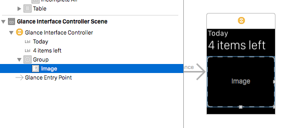
Fourth – and this is the most ridiculous one – you can’t overlap stuff. More than anything, this evokes HTML baby steps. Just look at how Apple’s own engineers coded Glance in the Lister app example. It’s the simplest of things: 2 labels in the middle with animated rounded progress bar around them.

Since you can’t overlap stuff, they were forced to render those two labels as background image for the group and animated progress bar is an image inside that group. Hello HTML’s image maps (rendered on the server) or dare I say…hello Flash.
It pains me to write this but WatchKit 1.0 layout is a step in the wrong direction. I truly hope this is some stop-gap solution they were forced into due to severe hardware constraints of the S1 chip. I hope that when full native WatchKit SDK is revealed in upcoming WWDC we will get proper layout engine, as even a very limited AL subset would be better than this.
If not, I don’t see myself writing much of watch apps in the future.