iOS 7
WWDC 2013 keynote was two days ago and I’m still struggling to come to terms with the changes introduced to my beloved mobile OS and, for over a year now, the field where I make my living.
On one hand, I’m extremely impressed with the stuff Apple introduced. There are very important and good API changes that are introduced, things that would help me and fellow developers make much better apps.
On the other hand…visual changes are…appalling, simply shockingly bad. This, from a company universally hailed as masters of making things that create emotional connection. Starting from lock screen, over the app icons and to the way UI controls are done, it’s heartbreaking.
When I think about user experience, I see it consisting of three important parts:
- how it works
- how it feels
- how it looks
This is not accidental ordering. From 1 to 3, it defines the weighted importance of long-term success of any human interface. It’s most important that it works well, that has a good basis to build on, so it can be slowly and iteratively perfected over time. It’s important that it feels natural and delights people over time while they discover how it behaves like a natural extensions of their actions and reactions. It’s important that it looks good, because we, humans, responds most positively to pretty things, with just the right amount of polish.
In that previous paragraph, lies the major issue with iOS 7 as it exists today. We, as humans, judge things in inverted order - from 3 to 1. We must like what we see at the first split-second, otherwise we tend to disregard the thing. And thus fail to discover the inner beauty.
I feel like Apple spent 99% of the time on the important metrics that will define the next decade of iOS, on works/feels parts. And 1% on the looks part.
I’m probably wrong, but that’s how it feels to me. From all that I saw in the WWDC videos (under NDA, so can’t really tell much) they wonderfully succeeded with 1/2. The API changes and new stuff that are introduced are great, building on amazing stuff done in iOS 6 (collection views, auto layout etc). The dev tools are improved and fixed in ways that took away the most troubling parts of the everyday development life.
The beauty and the feel of the animations and transitions more than once made me to jump with joy. I smiled like a kid in a candy store every time a transition happened from starting/closing an app, inter-app navigation, inner-app navigation between views etc. It’s really, really well done.
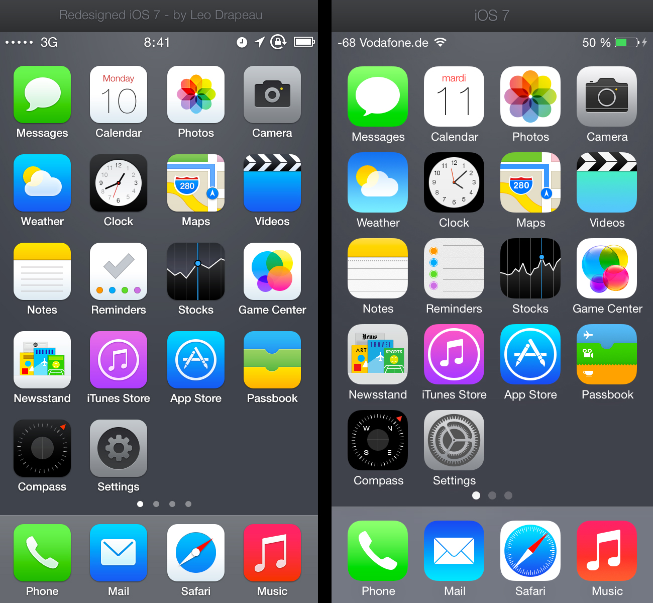
But those are all fleeting moments. The majority of time, I, as customer, am looking at these poor app icons:

And these wireframe-ish in-app icons (will 3rd-party service’s icons be auto-processed into this?):

And this terribly illegible UI:


And this inconsistently applied HIG direction:

And these garish line icons that poke me in the eye all while claiming they are done this way so they emphasize the content:


At first, I thought these are temporary stuff, part of beta 1. After all, it may look horrible but it’s important that developers get their hands on iOS 7 so they can prepare their apps. But then I realized that this is used in promotional videos on apple.com. This is used and details are specified in iOS 7 HIG. That they actually changed app icon’s corner radius and size (for the worse) which is not something you waste your time on is this is only temporary.
I now think this is here to stay for years to come, which is making me really sad.
Did it have to be this way? Absolutely not and few good souls used couple of hours or a day and showed what you could do with just a little more care.
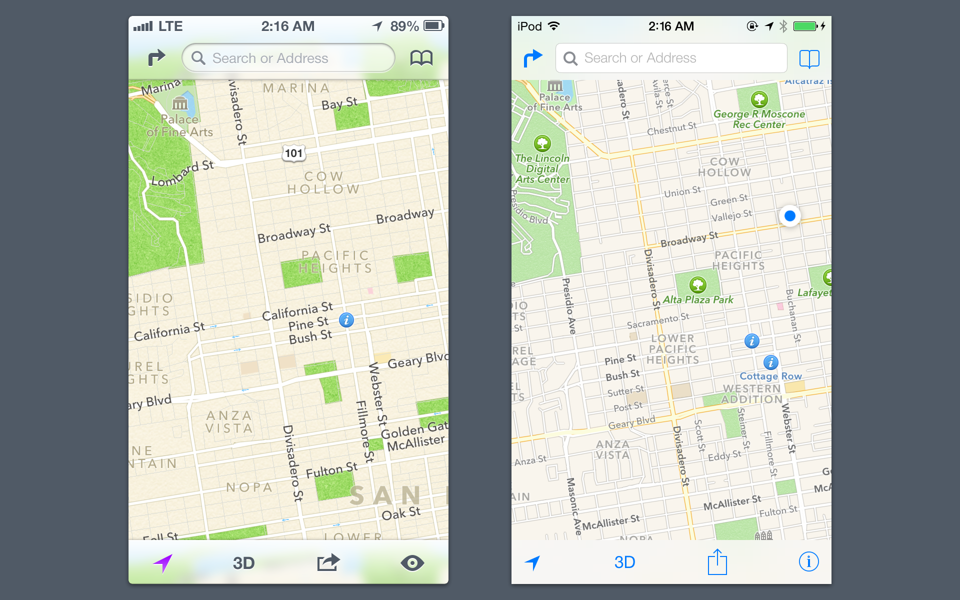
For goodness sake, just look at the maps example and tell me which one of the toolbar/navbar feels more natural. The app icon grid is beyond commenting - example on the left is more consistent, better looking and with perfect corner radius for the icons.
Apple set fire on the last 6 years of iterations and started from new. They could have taken a bit more time and start from a much better position than this 3-yo children’s scribble book.
Whoever pushed for and decided this is the proper way to go is not fit for the job. Apple has managed to move from the best looking mobile OS on the market to worst looking one, by a whole mile.
This is the current state of the market:
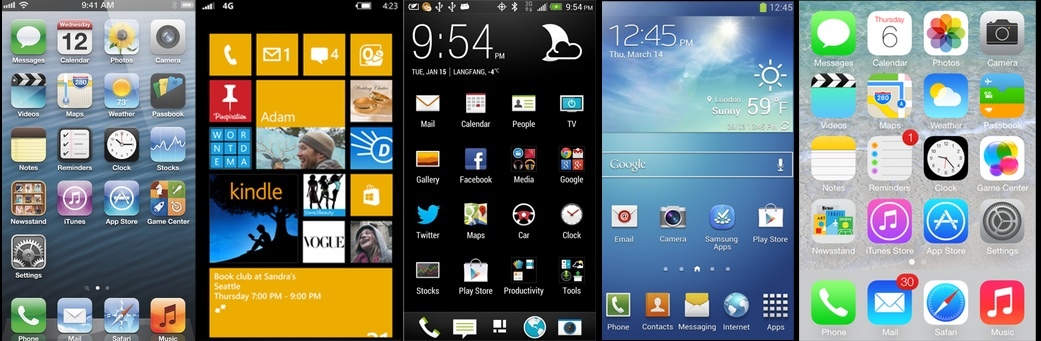
Now you tell me, honestly - if you knew nothing of the market and you are a feature phone customer going to get a new phone in the store - which one of the above would you choose?
Honestly?
For more perspective, agreeing and disagreeing with me, read these:
- MacStories, by Federico Viticci
- Craig Hockenberry
- Frank Chimero
- Stephen Hackett
- John Gruber
- Mike Rundle
- Ryan Katkov
- Entropy
- Jared Sinclair
- Chris Clark
- Ian Storm Taylor
- iMore by Rene Ritchie
Even people that are defending the iOS 7 visual changes, people that say this is how Apple rolls, compare it to OS X and iMac reboots - no one, and I mean no one is saying that they love the new looks. Can you remember a successful Apple product where even their most hardened supporters felt like that..?
Update (late evening of Jun 12): Matthew Panzarino just posted an amazing article at The Next Web, with several details that finally make sense in this whole mess:
- previous Apple UI team had no say about the iOS 7 UI guidelines
- those were done by marketing/print people
and possibly even former Color team
I’m lost for words. Jiminy!