Westciv award
About two months ago, Westciv decided to celebrate six years of StyleMaster with template competition. Goal was to design site template in desktop, print and handheld categories. As it happens, I’m used to regularly create all three of them. :) Using one of the runner-up graphic designs for my previous blog look, I quickly had it done, in a matter of few days, with the usual testing rounds with Mac browsers, handheld simulators and similar stuff.
From the URL, it seems I’m the third contestant that sent an entry and there were 49 entries in the end. Having entered so early, I’m even more happy that my work reached 2nd runner-up place.

Now that contest is over, I want to briefly point few things that can be found in templates I did.
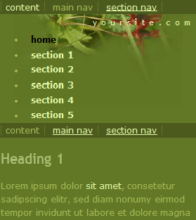
There is nothing spectacular about desktop template. I set the subject to be summer-forest-vineyard related. My family owns one small vineyard in the hills of south Serbia which is very beautiful in the summer, with dense patches of wood, fresh water springs and lovely green colour of grape leaves.
The HTML is lay out in correct, importance-wise manner, with few extra divs as design hooks.
Print template
This is my favourite gem here. My firm belief is that when you print, you need to print only the relevant content of the page. And by relevant content, I don’t mean only the actual copy, but also the site context.

So, instead of simply hiding everything but content div, I left the site title, and moved the active (current) items from first and second level navigation to the top. I can’t remember seeing something like it elsewhere.
Handheld template
Rules of competition stated that handheld templates will be checked in Opera 7, using SSR mode. Opera is by-far the best browser (concerning standards) in phone/PDA market and the only browser that properly implement media attributes. That means that if you write:
<style type="text/css" media="screen">

	@import "s.css"";

</style>

<style type="text/css" media="handheld">

	@import "h.css"";

</style>
browser should ignore h.css on desktop computers and ignore s.css on PDA/phone devices. Usually, handheld styles are much, much smaller, as the range of design tricks you can do is limited because of screen size and…well, common sense.

Unfortunately, majority of browsers in the market (which largely goes to Microsoft PocketPC IE) will render both screen and handheld, acting like there is no media attribute at all. Some other browsers (like some found on Palms) will ignore handheld completely and try to render screen. :(
Checkout the display of this template in PocketPC 2003 (IE 4.01).

Having worked in the past on the project that required handheld support, I learned that if you want broad PDA success, you need to copy your entire screen style and then toggle every offending or inappropriate CSS rule. Turn off floats, every width goes to auto, forget about more than 2-3 font-sizes, no padding or margin (except for vertical paragraphs) and similar stuff.
And lots of repeated skip navigation lists. They make moving through the page much faster. My usual set is:
-
start of page
-
start of main navigation
-
start of sub navigation
-
login form (if you have one)
-
start of content
-
end of page
You mileage may vary, as mine is. I admit I still have a lot to learn about this. But I’m positive that by recopying these link sets on the very same locations listed, you can speed up the site’s browsing and usability.
With congratulations to all winners, I want to say that I’m proud my work is included among such good work. All of the winning designs will be shipped with next version of StyleMaster - and it’s always an honor to be included with the tool that your peers would use.