em-based typographic grid
I have recently concluded the re-design of my serbian blog. It presented itself as perfect opportunity to try out grid-based design. Unlike most of the ready-made grid systems like BluePrint and 960.gs which are based on pixels (at least the examples I have seen) – I wanted to base it all on ems.
Another goal was to create as typographically good design as I could. It should follow the vertical rhythm, use the appropriate characters for given context and feature nice readable font faces.
I have created demo page that showcases all that nice typography. Another demo showcases some grid options.
Typography
In the demo page I tried to include every little detail that shows how all this looks like. It will serve me as the reference point for markup and entity codes. However, I don’t claim any breakthrough stuff here – all this stands on the work of other people, neatly combined in one reusable package.
I took most styles and leads from Jeff Croft’s presentation at Webmaster Jam Session and the excellent typography created by tipogrify engine, which is available as WP plugin.
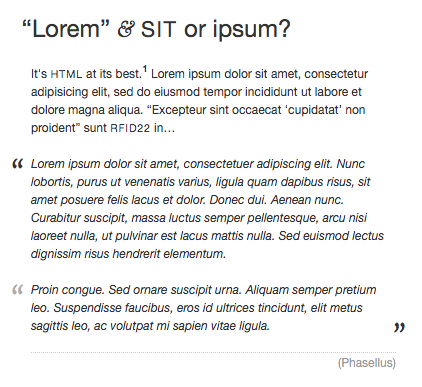
I shamelessly copied John Gruber’s footnotes – they’re simply wonderful, down to that lovely contour arrow for going back to the footnote link.
The rest of the lovely characters, like single and double quotes, en dash and em dash, elipsis – these I found through Peter Sheerin’s wonderful article The Trouble With EM ’n EN (and Other Shady Characters), from A List Apart.
This is where I read that old typographic styling of the blockquotes was that each paragraph was quoted at the beginning but only the last is quoted at the end.
Speaking of blockquotes, I have included Roger Johansson’s work – value of cite attribute is displayed below the quote. This was the most challenging part of the entire CSS and due to the use of advanced selectors and generated content IE6 and IE7 users will not see it properly.
Grids
These are not the only possible grids, you can do whatever you want, as long as you follow two simple rules:
-
Basic grid unit is: default font-size * line-height.
-
Every block on the page must use margin, padding, width and height equal to a multiple of basic unit
First rule sounds simple. In the body element, I defined that my leading (line-height) is 1.5, meaning that my basic grid block is 1.5em high and – for consistency sake – 1.5em wide.
There’s one caveat: if for any block on the page you change the font size, then you need to calculate its dimensions using new grid unit. Here’s one example, where I want ctop block to be 20 grid units wide (which would be 20*1.5em=30em):
.ctop {

	font-size: 1.2em;

	width: 25em; /* 1 / 1.2 * 30em = 25em  */

}
Since I enlarged the font, I adjusted the width for that, so that I can easily align it with some other block in the grid which uses default font size.
With that in mind, you can do anything you want.
I also want to re-iterate what I already wrote on the grid demo page: make your life easier and use normal, descriptive names for the blocks. CSS frameworks try to standardize the block names, so that you can add the suffixes and calculate the final size. And then you end up with grid6, prefix2, span-6, append-2 and similar non-sensical names.
After you built the layout, do you really need those classes? If yes, please write back – I would really like to know for what.
Me, I find them bloated. I draw the design on the piece of paper, write the sizes and spaces and then proceed to create a layout style with meaningful names like top, footer, main etc. YMMV, as usual.
Forms
Forms on your page will certainly destroy the vertical rhythm. You have no idea what are the exact sizes. Someone’s OS theme can vary this widely: it can have different base size, borders of this or that width, paddings…
The only way to fight this is to use min-height, also set in ems, also using grid unit multiples. I do this to control the comment form on my serbian blog.
Borders
The other thing that will dislocate your grid is border. For just about anything. Pixel guys have it easy here – they just subtract the border size from width and/or height and done. Here, things are a bit more complicated.
There are two solutions. One is to use negative margins:
.column {

	border-top: 1px solid #999;

	margin-top: -1px;

}
This works if your column does not already have margin-top defined. If it does, this will not be applicable.
Even if it doesn’t, this will still not work if the previous element is floated, and this one is not. That’s the case on my typography demo page, where footer has top border and 2 columns before it are floated. In this case, your only option is this:
.footer {

	position: relative;

	top: -1px;

}
I prefer to use the margin-top solution, whenever I can. Less problems in IE.
In any case, I do hope you like all this. I will certainly update this as required. Let me know if you use it or have anything to add.