Improving Shift key design on iOS 7 keyboard
I consider pre-iOS 7 keyboard design to be the best looking and affordably designed on-screen keyboard ever. The colors (subtle gradients) and animations when a key is activated were just perfect. When iOS 7 came, I was pretty annoyed how much uglier it looked like and consequently how it “felt” during use.
Which is why I casually followed the hubbub over the many changes during the 7.1 beta and the final result we were all given. Lots of people discussed it, mostly lamenting the result but I didn’t find any actual proposal for the better apart from Stefan Laketa’s colored button approach. Granted, I did not look much as I already said, but if there was something it would’ve blip on my twitter timeline (I follow over a hundred iOS devs and designers).
Here’s my proposal for the visual change but also a discussion about a larger issue with the keyboard behavior I did not notice before.
State of the keyboard
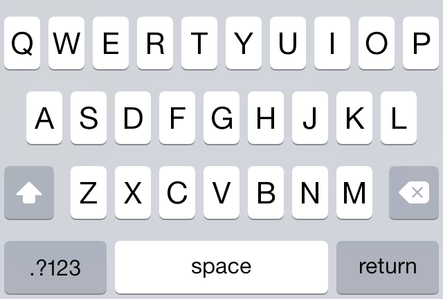
Ok, so this is the normal state of the light keyboard:
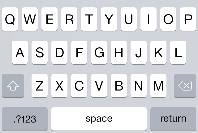
and this is its look with Shift key tapped:

As others have already discussed, this abrupt change from grey to white and combined with glyph’s even more abrupt color change is nowhere to be found in iOS 7. It does not seem to follow any guideline for how the active state should behave. If anything, it should be grey glyph on white background when tapped, certainly not black.
The main problem with this design is that large, filled glyph in the normal state is too jarring. When the keyboard appears, the white glyph is the first thing my eye is drawn to, which is the reason people call it confusing. In that split second when it appears, instead of actually starting to type what I wanted, I am forced to think “is Shift on? better turn it off”. And then I tap it and it changes entirely thus increasing the cognitive load and annoying me to no end for the wasted time. It’s all in the space of a second or two, but man - does it add up over time.
Visual solutions
The obvious solution would be to lessen the white area of the glyph and use a thin line:
With this small change, the Shift ON state would actually be the current OFF state:
Simply fill-in the glyph and loosely follow the active-state guideline for the iOS 7 icons. Actually, I did nothing special or new here - the design I propose is exactly what that older beautiful pre-iOS7 keyboard used. It was already a solved problem and for the life of me I can’t figure out why they messed with it.
Another thought is - why are Shift and Backspace keys using white glyphs on grey background while Return and .?123 use black glyphs? Why not draw them all using black lines and all would be better as well? Or with white line, doesn’t matter.
One reason for this design decision could be that those keys are more powerful - they either dismiss the keyboard or switch the entire keyboard layout, while the Shift/Backspace are altering/actioning on existing state. Still, food for thought.
The hidden problem
While working on this though, I realized that iPhone keyboard is “broken” on deeper level than just the Shift key visual design. And this issue exists since original iPhone OS.
You see, when you tap the Shift key, nothing else changes except the Shift key. No other key is visually changed, but the result of tapping any of the letter is changed.
Do you see where I’m going with this? The keyboard is lying to you - it always displays uppercase letters even though 99% of the time it will output lowercase letters. This happens only with the letters - switch to numbers and punctuations and try any of the keys - what you see on the key is what will be outputted. But not with the letters.
And this is the second, hidden source of confusion - because of this you have no other avenue than to decipher the Shift key so you know what will you actually type.
Things would be so much better if this was the Shift-OFF state:

and this the ON state:
I’m off now to file a radar for this.