iOS 7 redux
Two days after the WWDC 2013 keynote I wrote a post about the iOS 7 changes, mostly driven by gut feeling. Now, a week or so later and after constant daily use of iOS 7, I feel I should write a bit more about this.
I used iOS 7 on my second device (iPhone 5) but made sure I use it 90% of time, practically for everything I usually do expect phone calls / SMS (I put data-only card in it).
A few notes, about the NDA, this being early beta and such: I whole-heartedly agree with several others that publicly speaking about beta 1 of iOS 7 is far from inappropriate. This is not mere iteration of the established - this is radical departure, a reset of the whole UX and not only it’s not wrong to discuss it, it should be welcomed by Apple. We are not haters - we are the most passionate advocates of iOS. We care and we want it to flourish and improve. This is not hating, this is caring.
I re-watched the iOS 7 part of the keynote today to make sure I speak about and use screenshots of publicly shown stuff.
Overal verdict
In essence, my thoughts/feelings are still the same as that first-looks article.
- For iOS 7, Apple’s team has chosen a very poor and significantly limited visual language.
- At the same time, UIKit team has knocked it out of the park with API changes and improvements (withholding tech names due to NDA) - I want to marry dynamic transitions - etc.
Photos / Calendar are now such pleasure to use. I’m a big fan of gestures and the way spatial transitions work across the system, especially in Photos, Calendar and Mail. It’s so good and so satisfying that going back to iOS 6 is a serious pain.
Except…the visuals. No amount of animation joy can make me love this look. Every time I went to share something from Twitteriffic I would cringe. Every time I went back to springboard I would wince at the sight of that Safari icon.
The transitions in navigation bars, when title would fade/slide to a back button is great. I spent minutes (more than once) slowly sliding email message to the right and look how they nailed the transition to mailbox. Beauuuutiful. But then the back-button chevron would appear and poke me in the eye, being all so bright blue and bold right next to the Helvetica Neue Light.

I feared then and I fear now - this is not something that can easily be fixed. There are things that can be drastically improved and certain WWDC sessions are giving me hope it will happen. But there are fundamental issues with the direction Apple has chosen and I want to write down my take on it. It’s easy to be wise after the battle, so I’m writing this now and I want to see how my assessments will fare over time. To be honest, I would be happiest if I turn out to be dead wrong.
Issue no.1 - text with no soul
Helvetica Neue is a life-less typeface. It has no soul, no warmth, it’s a brilliant but neutral, robotic font. The only reason it worked fine in iOS 6 and before it’s because it brought balance to visually-rich environment around it, with textured bars, buttons and what not.
In iOS 7, on that crystal-clear canvas, it’s absolutely wasted, especially with Ultra Light variant that’s predominantly used. Which is all the more ironic for me to say, as UL is my favorite weight of the whole family.
Look no further than Stocks app.
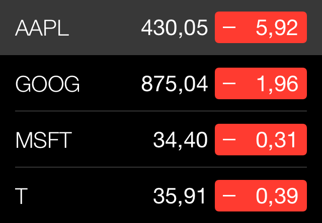
No joy, no life, just monotone light text on dull background. Trust me, there is no color combo that will fix this.
You can also look at the keyboard, as another example.
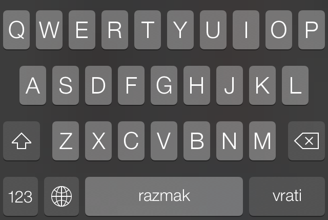
I loved typing on the pre-iOS7 keyboard, I wrote a good deal of project specs, emails and blog drafts with my iPad. The loveliness of the keys springing up and beautiful gradients subconsciously induced pleasure in use. This one is boring and uninspired.
Want more proof of this? Ask your self - where does this new system font works the best?
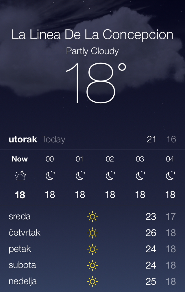
In Weather app, with visually rich background to balance it out.
I’m really, really surprised Apple went with that font when they had a perfect choice already there in front of them, on iOS 6: Avenir Next. I actually think that it may well be the case that Avenir Next was a candidate for next system font while Forstall was in charge.
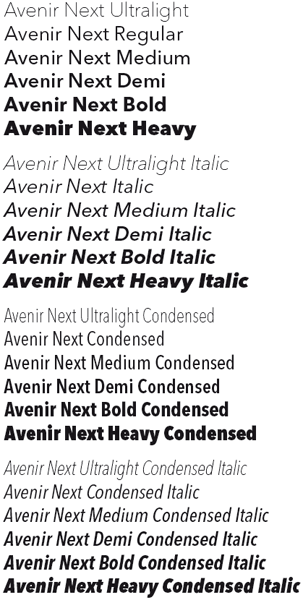
Avenir Next is joyful font, full of life, very distinct at both light and heavy ends. One thing I can guarantee - it will be featured front and center in my future apps.
Issue no.2 - transparency
It’s easy to bring Windows Vista into the picture to blight the iOS7 transparency. That would be the cheap shot. Instead I will use few examples from iOS 7 that will show you how very hard to control transparency is.
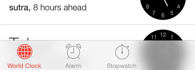
One might argue that these issues will be resolved with better background detection and better algorithm for image processing and…it’s all wasted time and effort. Because in order to make that Timer icon visible on black backgrounds you need to practically invert the colors, making a dynamic gradient. So you end up with a selected red icon, and a bunch of distinctly gradient-ed lines, leading to a visual mess.
This approach has the same weakness as Facebook Home had. Which is that it looks perfect with carefully chosen backgrounds, the same way Fb Home looks great in the demo world where all your friends have JD2-level photography skill. In real life though, it’s a disaster.
The only way transparency is somewhat going to work is when they reduce it to a bare minimum, like 2-3%, making the content below barely visible. I predict that this will happen towards the final release.
Issue no.3 - iPad mini
I have no idea how will iOS 7 look like on iPad mini, possibly the most popular iPad model by the time its retina successor is out. Seriously, can anyone imagine 8pt HN Ultra Light on non-retina screen?
I set iOS Simulator to non-retina iPhone, but it’s not a good test of the iPhone, it’s a test of my MBP screen. It’s quite possible that on non-retina screens certain legibility setting will be defaulted to ON.
Issue no.4 - the missing UI
Apple is very adamant about the role UI elements should play in iOS 7 - it’s a supporting role to the content. UI must defer to the content and disappear from the screen as much as possible, whenever possible. Hence the complete removal of all backgrounds and borders from all bars and buttons. Hence the transparency. Hence the ultra light font and in-app icons.
Just as original iPhone OS UI removed the physical keyboard to leave more useful room for the content, Apple is now pushing further down that path by attempting to remove the on-screen UI as much as it can.
I have no doubt that at some point in the future they expect that Siri will be the main UI, with this on-screen noise rarely needed, if at all.
Siri, open apple.com Siri, save to read later Siri, summarize my email in last hour Siri, message XXX… Siri, buy ‘Q Music Sessions’ album by ‘Within Temptation’
Etc.
Hmm…I don’t know what to think about it. I’m not a fan. Reading email is not pleasant at all because the tab-bar is transparent white so it plays tricks with my mind - it draws my eye downward while reading and bright-blue sharp icons poke…well…
I like visually separated bars because they naturally create a separate canvas for the content and thus emphasize the content. I like them best when they blend into the device around it, which means they should be as dark as sensible. Why? If you have the black iPhone, it’s obvious. But even if you have the white one - like I do and like all the presenters at the keynote used - that one still has a noticeable 2mm black border around the screen. You can theorize that future iPhones/iPads will have no bezel at all, but I seriously doubt that is the case.
The future
Like I said, I would be very happy to be very wrong. I will have to accept this change, one way or another. There’s a blog post I’m writing on how my indie dev shop will approach iOS 7, should be up soon.
In the mean time, I urge you to read the following great articles, especially the last one, if you still think all this criticism is inappropriate and misguided.
Further reading
- Jared Sinclair
- Max Rudberg
- Michael Heilemann’s triage: post 1, post 2 and post 3
- Final Michael Heilemann’s post