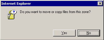
Q: Would you like to move or copy? A: Yes / No?

This is in Windows Explorer, copying/moving files across networked disks.
Given my experience so far in big software projects, this kind of bad UI is direct consequence of the background API being done before front-end people had any say. At the moment when front-end work came to play, there was probably no info to determine is the current operation a copy or move, so they did what they could. Or it could be sloppy FE work, but I somehow believe it’s the former.