Dear Apple: please eat your own dog food
Dear Apple,
I really like the stuff you make. Really. I have an iPod, I’m waiting for you to release Leopard so I can buy it with MacBookPro (would be my first Mac…it would be nice if it was a 12-13" size). My next phone will probably an iPhone (I expect that in Europe it will have 3G support). My friends are calling me an Apple defender, Apple fan, part of the cult. You know, the usual.
I also like Mac OS X design. It’s nice, intuitive, beautiful to look at. That is why for instance I use a Thunderbird theme that resembles Tiger Mail. Mail client is an application I use daily and as such it must look good.

I want you to note two distinct stuff on the previous screenshot.
First, If you haven’t recognized it, I’m using Windows XP. You are probably puzzled because you don’t see those ugly, beveled interface that Microsoft ships with it (I even forgot how it’s called). I’m using wonderful System5 visual style.
Second, you can see that my T-bird theme is not identical to what its author created. The scrollbars are not Mac OS X scrollbars, but rather the same scrollbars I see all around my Windows installation.
You see, I spent some time - quite a lot of time actually - to make my OS the way it works for me and provides me with an engaging environment. My OS is now visually great and I hate apps created by people who think that their interface taste is better than mine. That’s a subjective thing, it’s for me to decide what I like.
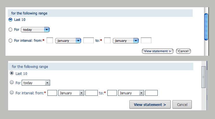
Which brings me to the point of this letter: please keep Mac OS X interface elements on Mac OS X. Do not bring them to Windows. They look like sh*t there, completely out of place.

It’s even worse when you look at it along with other applications. Even heavily skinned Thundebird is not so jarring to the eyes as this Safari interface is. Even Total Commander now has full respect for the OS interface.
Mac OS X controls on my XP look like that Vista’s childish interface, all shiny, colourful, beveled, reflective…I noticed that you also went childish, but I hope that it can be re-styled with something worthy at least a teenager, if not an adult person. An eye-jarring experience, certainly.
All your proud talk how Leopard now has unified interface - it’s good, heart-warming. It’s how it should be. Then why are doing differently when you create apps for Windows? If you think they are lovelier that way, allow me to correct you - they are complete and utter shit from the aspect of interface design! They are ok on your playground but when you bring them to Microsoft’s backyard then obey the rules there.
Otherwise you’re just a wanker and no one’s gonna play with you. Except us, web developers who must. You have your strict HIG rules and Mac users around the world are bashing anyone not following them. Even you when update after update you’ve broken your own rules. Until this Leopard uniting, which I won’t bet how long will last.
You might not like Microsoft interface, but leave that to the end user. Follow the rules. Eat your own dog food.
Best regards,
–
AV
p.s. That transparency in the menu bar and reflections in the dock you’re so proud of that you put them as 1st of the top features…I mean, didn’t you learn anything from Vista? They are crap and render the menu bar less usable. Geeez…And when I remember that you mocked Vista for copying and general feature crapiness…Shame on you.
p.p.s. While you’re at it (fixing your Windows apps) take a look at iTunes. It’s the resource hog on my machine. More greedy than Photoshop, more greedy than Visual Studio. Pretty please..?