CardroomSupply.com - web design review
I don’t think I ever played poker extensively. I remember playing Raub a lot few summers, a very simple and addictive hungarian game of cards. And that’s about it.
Thus you can imagine that I never needed a professional poker furniture. Guys from Rounders would probably have a thing or two to say on it, but not me.
![]()
Thus, I’m not a guy who would be a customer of CardroomSupply.com nor I can give you a review on the goods and services they provide.
What I can review is the web site through which all these beauties are sold. Full disclosure: this is payed review through ReviewMe.com service.
Overall layout
When I first opened the home page, my eyes were first drawn to…FHM logo on the right. Yep. It’s the biggest, most impressive visual on the top of the page. Somehow I doubt this is a desired behavior of the potential buyer. This would better be placed in the left sidebar, at the bottom, and with a bit subdued colors.
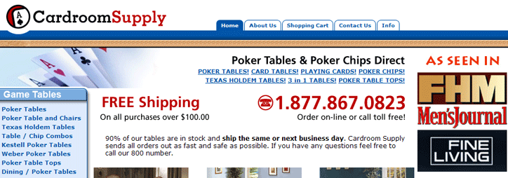
Second thing I saw is the “free shipping” and the phone number, which is good. Whenever I’m shopping, having contact/order number close-by is always a boon. If I see a product I’m interested in and I need more information, I don’t want to leave that page to be able to see the contact number. This is the best thing on the whole web site.
Link list in the top middle requires mental push to actually read it. It’s written in all caps (which is considered shouting in online communication) and all the links are very close to one another. Almost the same thing is repeated in the navigation in the left sidebar, and there is little difference between them. Why two?
Recommendation: decide do you want a top or left-hand navigation, and use the other space for other purposes - like moving the “free shipping” + phone number part to the top.
Home page as a whole is a bit of a mess…Apart from mentioned FHM logo which really stands out, other graphics are all pretty much the same, all look visually equivalent. Thus my eyes simply glided from one feature offer to another, not really stopping at anything. Instead of having 3+3 boxes in the middle and 2 best offers on the right, I would recommend to have best offers to be as wide as both central and right column and a distinctive background and then to have the other offers below, grouped in two or three boxes with different visuals.

The actual product page is fine, apart from the fact that product name header is small with dull gray color. The shopping cart widget is good, with clearly shown price and nice big “add to cart” button.
What is really needed here are much larger product images. I really hate the Amazon-induced stereotype that when you click on “larger image” you get something like 50-100% larger image. Amazon sells millions of stuff from 1000s of sellers. Here you sell your own products - why don’t offer a 2000x3000 (or vice-versa) versions, professionally shoot (the given larger images show compression artifacts), so I can really look into it. Give me detail close-ups too. If I’m willing to pay a $1000 for a poker table, I would certainly appreciate an ability to see it more closely and from different angles. And since I’m deliberately clicking on it, it does not really matter what size those images are - I will wait until they download and use that time to read more from the product page.
Informations
Contact us page is bland with huge “check order image” which looks rather childish. This order check feature is actually a really desired feature considering the fact that cited delivery times can be in weeks. As such, this feature should be prominently placed at the top of the all pages (especially home page), along with phone number.
About us page is again very bland. It should have more images, quotes from magazine reviews, possibly links to videos - either from TV reviews or videos shoot by CardroomSupply. In the YouTube internet of today, bandwidth is a non-issue. Info tab and About us should be merged.
I also found a strange link at the bottom - for poker tips. This is the only article of this sort that I have seen and somehow looks like thrown in. It does not fit.
Such articles are great SEO tools - if you have a bunch of them you can draw links to your site from all kinds of places. This in return gives you better page rank and better findability on search engines.
However, if you want to do that, do it properly - create a whole sections for it, give it a link in the top navigation and publish new stuff. The more the merrier. If the content is good, then people will start linking to it on their own.
Technical impressions
Being a firm supporter of semantic and valid markup and CSS-based designs, immediately upon opening the home page I noticed signs pointing to outdated code. Here is lower part of the sidebar in IE6 and Firefox:

While this does not necessarily has anything to do with coding, it is almost a rule to see this kind of problems on pages using invalid markup. If things were properly coded, there is no way that central column and sidebars would overlap like that.
Validating the home page yields 87 errors, but the number itself does not gives full scope of markup problems.
First, there is no charset defined, at all. It’s not a given fact to what will browsers fall back. This is just one line of code, either client or server side and there is really no excuse for not including it. DOCTYPE is incomplete HTML 4.01 Transitional - adding just the URL would be enough, although I would recommend striving for at least 4.01 Strict.
The real scope of the markup problem is revealed when looking in the source code. There is script block being placed inside the HTML element, but before the HEAD element. This is Yahoo shopping code and at first I thought maybe this is a fault of the Yahoo. It seems unlikely given Yahoo’s recent YUI stuff, but I went to Yahoo! Shopping home page anyway, randomly checked few stores and have not seen this repeated. What I have seen that many stores have just as like-1996 markup, which is very sad.
The code is an old-school (sic!) tag soup, with over-bloated markup practically screaming for clean up. For example, this list of links at the top:

is coded like this:
<table border="0" cellspacing="0" cellpadding="0">
<tr>
<td align="right" valign="top" class="introlinks-cell"><a href="http://www.cardroomsupply.com/pokertables.html" class="introlink">POKER
TABLES!</a> <a href="http://www.cardroomsupply.com/cardtables.html" class="introlink">CARD TABLES!</a> <a href="http://www.cardroomsupply.com/playingcards.html" class="introlink">PLAYING
CARDS!</a> <a href="http://www.cardroomsupply.com/pokerchips.html" class="introlink">POKER CHIPS!</a><br>
<a href="http://www.cardroomsupply.com/tehota.html" class="introlink">TEXAS HOLDEM TABLES!</a> <a href="http://www.cardroomsupply.com/dipota.html" class="introlink">3 in 1 TABLES!</a> <a href="http://www.cardroomsupply.com/tabletops.html" class="introlink">POKER TABLE TOPS!</a></td>
</tr>
</table>
Just look at it - it’s the simplest possible link list. There is absolutely no need to use anything but A elements for it:
<p class="introlink">
<a href="http://www.cardroomsupply.com/pokertables.html">POKER TABLES!</a>
<a href="http://www.cardroomsupply.com/cardtables.html">CARD TABLES!</a>
<a href="http://www.cardroomsupply.com/playingcards.html">PLAYING CARDS!</a>
<a href="http://www.cardroomsupply.com/pokerchips.html">POKER CHIPS!</a>
<br>
<a href="http://www.cardroomsupply.com/tehota.html">TEXAS HOLDEM TABLES!</a>
<a href="http://www.cardroomsupply.com/dipota.html">3 in 1 TABLES!</a>
<a href="http://www.cardroomsupply.com/tabletops.html">POKER TABLE TOPS!</a>
</p>
You can see that class="introlink" which is placed on each link is now put on the parent element, thus instead of a.introlink {} one can use .introlink a {} and achieve the same thing with less code.
Further, to save precious download bytes, there is no need to repeatedly use site name in the links - just use absolute paths:
<p class="introlink">
<a href="/pokertables.html">POKER TABLES!</a>
<a href="/cardtables.html">CARD TABLES!</a>
<a href="/playingcards.html">PLAYING CARDS!</a>
<a href="/pokerchips.html">POKER CHIPS!</a>
<br>
<a href="/tehota.html">TEXAS HOLDEM TABLES!</a>
<a href="/dipota.html">3 in 1 TABLES!</a>
<a href="/tabletops.html">POKER TABLE TOPS!</a>
</p>
And there you go - in few simple steps we have much cleaner code for maintenance.
Almost every bit of the code can be put through the same analysis and clean up and it will come up better, and smaller. I could go on and on (like: none of the images has required alt attribute) but I think this is enough.
Closing words
My warm recommendation would be for this to be given to a professional HTML/CSS coder for a complete overhaul and to a interface designer for adjustments.
I have browsed a lot through the pages and from what I could see these poker tables look really sturdy and beautiful. They deserve a much better presentation.