www.vesic.org: case study
Dejan Vesic is a good friend and colleague of mine. He has a small but valuable web site (all in serbian), which was built back in the old days.
Recently Ana, one of the designers from our company, created new graphical look for the site, which was, at first, implemented by Dejan as table-based layout. Heh…that’s an understatement :) - there were so many tables in such a simple page that it was dying to be built based on CSS. Dejan was all up for it and, as first step, corrected the HTML to be valid HTML 4.01 Strict.
Few days ago he asked me to convert the markup to simpler layout, based on CSS, which I gladly accepted. Such conversions are trendy, and I just love doing them. Final gains were numerous:
-
page template (design sans actual content) went from 9.8kB to 3.8kB (almost 3x)
-
both top and left navigation are now fully accessible (they were drawn from Javascript)
-
badly-repeating background images (on tables and tds) that were breaking the graphic design now falls in nicely
-
several smaller bg-images were combined to just few, thus saving HTTP requests
Compare the templates:
Fixing accessibility, simplifying code
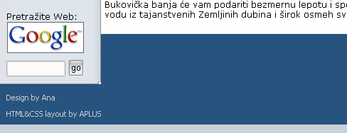
First step was to remove all tables and then re-arrange the content and mark it semantically. At the top, I left the site name, with current date and top navigation (which is 2nd level here). Site became a paragraph, since Dejan was already using h1 for articles titles.
Navigation should have been put near the page end, and then moved up with absolute positioning. However, due to the design used, this was not possible. Better said, it was possible, but then the whole thing would break when text is re-sized. Skip links (which were not added) should take care of this. Leaving sub-nav at the beginning is (pretty much) logically correct, as it acts as table of contents for the chosen section (from the left-nav list).
Then comes the actual page content followed by main navigation, links area and footer. Main content and main navigation + links area are enclosed in their own divs, so they can be floated left and right to create columns.
Footer simply consists of two paragraphs.
All in all, the whole HTML code went almost 3x down, with added benefit that navigation is now usable by default. Being a programmer more inclined to C# then to HTML, Dejan built the navigation out of Javascript, where he could highlight the current section programmatically. I inserted the navigation directly into the page, and then used some very unobtrusive JS code to kill the href and re-style current link.
Styling…
This is very simple, 2-col layout, but the graphical design required some background-image tricks. Top line contains the date and top navigation, both being styled differently. Since the layout was fixed to 750px, I created that wide and fairly high background image that will keep the graphical look even if you pump-up the text size few times.
For the main navigation, I first removed the header, but not with display:none (because screen readers will miss it) - positioned it absolutely and made it invisible. I then used one background image, positioned bottom to implemented the design.
Links area was styled similarly, only here I used two images, one on div and the other on the header.
Bottom is clearing the floats, and then applying some simple styles. Nothing too hard and it even worked in IE too, on both Mac and Win. Just until you add some actual content.
…and tweaking
When I was done, I gave this to Dejan and he rebuilt all pages in Dreamweaver. Then the IE-Factor kicked in.
First thing I tried was to add position to the clearing element, which usually helps.
    * html #copy {
    	position:relative;
    }
And it really does - IE was now correctly drawing bottom’s background color, in line with left column. However, there was another surprise.
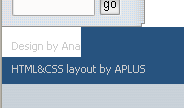
OK, I thought, this is starting to look like long one… I tried few random stuff, but none helped. Since I already made the paragraphs relatively positioned, I opted to make design-by links absolutely positioned and moved them to the left end.
    * html #copy, * html #w3icons {
    	position:relative;
    }

    * html a.design {
    	text-align: left;
    	position: absolute;
    	left: 10px;
    	float: none;
    }
But when I refreshed in IE…

Now, that is completely ridiculous. IE acts as the paragraph is floated (or absolutely positioned), and shortens the paragraph width to the width of content in it. Or is it really..?
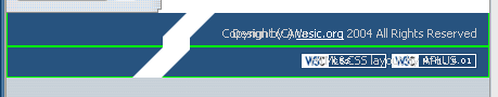
So the paragraph is still as wide as it should be. Jolly good. How then to force the bug-infested piece of crap to realize that? Simple. Just tell him what he already knows.
    * html #copy, * html #w3icons {
    	position:relative;
    	width: 750px;
    	w\idth: 730px;
    }

    * html a.design {
    	text-align: left;
    	position: absolute;
    	left: 10px;
    	float: none;
    }
And this finally solves it all. Applying dimension to solve IE problems like this, is something of the common thing (For liquid designs, the Holly hack should be used.) Common or not, it still manages to get me with my pants down, where I stare at it like a baboon, in anger and despair.
Like I said before…I really, really hate this PoC.
Happy end
In the end, all is (hopefully) well. Dejan will soon convert all of his pages to this new layout and publish it. Another one down, many more to come.