From 5-level-nested-tables to clean CSS design
My company’s main product is called MarginMaker, a comprehesive betting platform for telebetting, shops and internet betting.
Our most recent client first bought telebetting, and when that was completed successfully, they contracted us to expand to Internet betting as well.
First incarnation of the web site was build with features at the fore-front. We were to create web site that will allow the customers to place bets in the fewest steps possible, as well as give them ability to quickly sift-through betting offers. Since all competitors already had web sites, we were in position to analyze them, see what is good and what is bad and build something better.
So we did.
Web site had all the bells and whistles, with floating betslip that would follow you to every page you go (unique feature no one else had), live price update without page refresh etc. Site is very dynamic (using ASP pages) and display could totally change in a matter of minutes.
And all of that worked in modern browsers, as well as IE 4 and partly in NN4.
Client’s decision to support 4.0 browsers gave us a lot of trouble. We coded several versions of the same script, layout was built using bloated markup; from time to time, client asked for some new feature or change to be incorporated which, in the context of time-frames, often lead to more bloated markup.
So in the end, we had average home page of about 80k HTML, with 300kB od javascript’s, multitude of images and Flash banners and some stylesheets. This was slow to download, so we placed all scripts in HEAD part to cache them (IE does not cache external javascript files called in BODY part).
This then introduced the delay to content - even with all files cached, browser still sent almost 30 HTTP requests to check has the files changed.
On above-56k connections, all this was not a problem and customers liked the features and number of registered users quickly grow. But for majority of UK modem users, site was slow. The fact that most of them used free services like FreeServe made things worse (those ISPs are often overloaded which leads to unacceptably long wait for HTTP responses).
So, we looked for solution. IIS log analysis revealed that 99.1% of users used IE5+, with IE 6 being 72.4%. Using this and lots of talking, client agreed to redesign using modern web technologies and abandoning full support for old browsers.
Here follows a tale of converting multiple nested-table layout to valid HTML 4.01 + CSS layout.
In the end, we got 5x smaller files and 10x faster web site.
Although I work for Finsoft and here describe one of its projects, this blog and thus the following write-up has nothing to do with Finsoft Ltd. All expressed views are entirely mine.
In the beginning, there was…
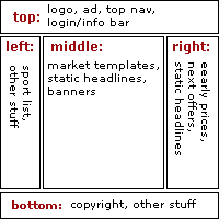
Layout used is one of the most popular: top + 3 columns + bottom. Each of these parts consisted of several small boxes, with top easily being the most complicated. At the very top was logo and banner next to it, followed by the row of navigation buttons. Then comes the row with doable layout - login form at first, and series of account information (name, balance etc.) when user is logged in.
Also, when user is logged, Open account option is removed and My account is placed there, which is actually dynamic menu with several options like My preferences, Change password etc.
Left column was rather static - list of sports could change from time to time, but it could be considered fixed.
Middle column is pretty dynamic, depending on the moment. It can be just column of texts, or it could have various betting templates with banners in between. Its size is changeable, sometimes taking over the right column.
Right column is also dynamic, and it features more betting information (nearest events, early price offer for horse and dog races).
Bottom part has copyright line, telephone numbers and a list of accepted credit cards.
We also had to deal with various dynamic features:
-
prices and handicaps was to be silently updated (without page refresh)
-
betslip should always be located at the right edge of middle part and it should follow user when he scrolls
-
state (closed, suspended) of in-running markets on the home page was to be checked
-
visualize adding/removing to/from betslip
etc…
This is where those 300kB of scripts were spent. That is what we had to deal with. More and more tables were added with each new feature: one for general layout, another to align the content that was very different (betting template and static text with added image, then 2 or 3 tables for each template to make them aligned and with predefined width. Then throw in some compromises for automatic table generation…
You get the picture. Take a look at HTML for the old home page and you’ll see what it looks like. Real hell to maintain, and pretty much the same for browsers to render (NN4 took 15s! to render the page after is has downloaded all data).
Major problems were:
-
HTML size is 50k```objectivec
-
HEAD part size is 4k```objectivec
-
There was ~30 HTTP request in the HEAD alone (each of them with 0.2 to 1s latency)
-
Script size few hundred kBs, needed to deal with 3 document object models
-
some ISP’s transparent proxies which forced users to SSL (but that is another story)
First time access on 56k took 60-75s for content to appear. Subsequent visits, on the clear link (so HTTP responses came quickly) was 10-15s, so it was bearable. But that is not enough in this case - customers are people that have come to spend money, so they should be given “very good”, not “not that bad”.
Healing begins in the head
First step in transformation was to identify page elements for what they actually are and to mark them accordingly. This will simplify future updates and extensions…to handhelds for instance. Each meaningful part of the page was to be in text, and then beautified with image-replacement.
Logo was the obvious choice for top-level heading, so this was marked as H1. It’s also a link to home page. Markup used is this:
<h1 id="companylogo">

<a href="/index.asp">The sports bookmaker.</a>

</h1>
Now, we use this style to replace the text with logo and to keep the link:
h1#companylogo {

	float: left;

	margin: 0;

	padding: 0;

	border: 0;

	width: 240px;

	height: 55px;

}

h1#companylogo a {

	text-decoration: none;

	background-image: url(/images/topbar/logo.gif);

	background-repeat: no-repeat;

	margin: 0;

	padding: 55px 0 0 0;

	border: 0;

	width: 240px;

	height: 55px;

	he\ight: 0;

	display: block;

	overflow: hidden;

}
Style of H1 makes sure that logo is floated left and uses minimal needed width, since we want to place the banner next to it. Banner has no structural meaning, so we placed it inside of simple DIV element.
For the logo link, I used LIR, as it appears to be the best of breed. Initially, we used Mike Rundle’s technique, but that one failed in IE 5.0, so we reverted to this.
Top navigation
This is the list of links. As shown many times, such list is semantically best marked as unordered list. In this case, we need to achieve rollover effect, and entire area (not just text link) should be clickable.
In the old code, we defined event handlers for onmouseover, onmouseout and onclick for each table cell. Such markup had 7:1 ratio for whole markup vs. actual content (link markup was counted as content). Do I have to mention that this was downloaded on each page.
As previously mentioned, when user is logged in, Open account is replaced with My account drop down menu. To achieve that, we used ADxMenu, so we also used its css style for this list. Markup is this:
<div id="topNav">
<ul id="topNavList">
<li><a href="/index.asp">Home</a></li>
<li><a href="/help/index.asp">Help</a></li>
...
</ul>
<div class="clearer"> </div>
</div>
This markup has ratio of 1.5:1. CSS style is very complicated though, due to current browsers quirks and bugs. Now, compare complete markups and draw your own conclusions about the benefits of structural markup used in combination with CSS.
<div id="topNav">
<ul id="topNavList">
<li><a href="/index.asp">Home</a></li>
<li><a href="/help/index.asp">Help</a></li>
<li><a href="/casinointegration/casino.asp">Casino</a></li>
<li><a href="/account/register.asp">Open account</a></li>
<li><a href="javascript:BS_BodyToggle()" id="BS_topnavSlot">View BetSlip</a></li>
<li>
<input type="text" class="colored" name="FBF_keywords" value="" size="10" maxlength="100">
<input type="button" class="button" value="Search" onClick="FBF_SetFormAndVal(this.form, '/')">
</li>
</ul>
<div class="clearer"> </div>
</div>
<table border=0 cellspacing=0 cellpadding=0 class="topnavcontainer" align="center" width=770 id="SS_NoPrint"><tr>
<td nowrap width=90 align="center" class="topnav" onClick="SS_BOClick(this, event)" onMouseOver="SS_TopNavOn(this)" onMouseOut="SS_TopNavOut(this)"><a href="http://old.sj-web.com/index.asp">Home</a></td>
<td nowrap width=90 align="center" class="topnav" onClick="SS_BOClick(this, event)" onMouseOver="SS_TopNavOn(this)" onMouseOut="SS_TopNavOut(this)"><a href="http://old.sj-web.com/help/index.asp">Help</a></td>
<td nowrap width=90 align="center" class="topnav" onClick="SS_BOClick(this, event)" onMouseOver="SS_TopNavOn(this)" onMouseOut="SS_TopNavOut(this)"><a href="http://old.sj-web.com/casinointegration/casino.asp">Casino</a></td>
<td nowrap width=90 align="center" class="topnav" onClick="SS_BOClick(this, event)" onMouseOver="SS_TopNavOn(this)" onMouseOut="SS_TopNavOut(this)"><a href="http://old.sj-web.com/account/register.asp">Open account</a></td>
<td nowrap width=90 align="center" class="topnav" onClick="BS_BodyToggle('', this)" style="cursor:pointer" onMouseOver="SS_TopNavOn(this)" onMouseOut="SS_TopNavOut(this)" id="BS_topnavSlot">View BetSlip</td>
<td class="topnavflat" align="right"><input type="text" class="colored" name="FBF_keywords" value="" size="10" maxlength="100"></td>
<td class="topnavflat"><input type="button" class="button" value="Search" onClick="FBF_SetFormAndVal(this.form, '')"></td>
</tr></table>
Since CSS deals with rollovers and clickable region fix, scripts got smaller, with around 4:1 ratio. Yes, really that much.

Due to browser quirks, we had problems with some outdated browsers. Fixed width for list items lead to ugly wrapping on the last item in Opera 6 on Mac. Newer browsers support white-space property, but Opera does not (and IE5.0 on Windows as well). Fixing this would complicate the CSS even more, so we let it be.
Login bar
This was a real puzzle. It has current server-time clock, login form and forget pass? link or (when user logs) it has clock, several pieces of text information and then form again for logout button.
We tried this and that, but none of the solutions was really satisfactory. No matter what we tried, some of the browsers caught us in its net of bugs and the display was jumping up and down (unfortunately, I don’t have screenshots to show it), which our client did not want to accept. So this ended up with too much markup, but we had to make that compromise.
This will definitely be the part which will be worked-on in the future. I can just feel that there is some simple markup that can accommodate what we need - it just waits to be found.
Middle part
The content is horizontally centered. To achieve that, each part of the web site has the container who’s style includes this:
margin: 0 auto;
First value is for top and bottom margin and it can be anything you like. Second value, auto, will center that element in any CSS2 compliant browser (Gecko, IE6, Opera 7). For others, content will be placed at the left browser edge, which is best possible downgrade.
Since the middle part has 3 columns of variable height, best way to work with them was to float all three. To centered them as group, enclosing content DIV is used, and clearing div is placed below the three floated columns. Enclosing DIV has one additional task - to define coordinate system for betslip. Betslip is betting term for facility where you collect your selections (atomic item on which you can bet, like Tiger Woods, Real Madrid etc.) and can combine them in multiple bets. Betslip was to float at the right edge of the content. Easiest way to do this is to do position:relative for content DIV, and then do right:0 for betslip DIV.
Each of the columns contain diverse content. Sport list in the left column was styled as unordered list, this time vertical one. Markup is very similar to top navigation list, as this one has identical behavior, thus the same savings in download size. Header is marked as H2 for which LIR is used again.
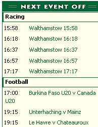
Early prices and Next events are in the same level as sport list, so their headers are marked as H2 as well. Sub headers in Next events are marked H3, and each item is simple paragraph. Additional markup (span) is used for times so with proper CSS style we could position them at the left (display:block;width:50px;float:left). To avoid overlapping, each paragraph has clear:both.
Text teasers in the middle and right columns are again semantically styled as H3 and P. Since images has no real structural meaning, best way to display them would be as background image for the P elements, with appropriate padding-left. Well, not this time, brother.
Client has content manager people who’s responsibility is to setup database objects for web site display. Finsoft created desktop application where they can easily setup all sorts of betting content - templates, sport list, number of next events…and these text teasers. For each teaser, content operator can choose the image from the image repository and type the text (they can use HTML codes too, so if you see b or font tags there, it’s their doing O:).
Because of that, images are placed using IMG tags. On-the-fly change of stylesheets would consume too much server-time and style sheets would be constantly downloaded again. Too much overhead, so we used simple solution. Each teaser is enclosed in DIV with appropriate class name. There are three types of teasers, so this way we could style them as .topoffers h3, .nextevents h3 etc.
That leaves us with the most important part…
Betting templates
Betting pages are the ones that receive majority of visitor hits, meaning that they have to be fast as hell. At the same time, client wanted to have certain look&feel;: regular markets should be 400px wide and occupy middle column, while coupon templates should take the space of middle an right column and be 600px wide.
Additional problem is that template content is volatile: we could have 2 to 5 headers with totally different information, column count is varying, columns should be grouped by alternating background colours, each row should be separated, and in one case several rows should additionally be grouped.
Here is one way to accommodate such diverse spec. And here is another that is currently used.
As you can see from linked examples, second way is always smaller in size, and each piece of information has actual meaning. Market name is H4, event name is H5 and additional notes (special note from trader, TV viewing info) are simple Ps. table markup is used for data that are tabular - selection name, price, handicap etc. Complete template is enclosed in DIV for simple styling (same technique as with text teasers), to give them all the same width and to position several dynamic features according to template only.
Now we have prepared the ground for future handheld stylesheet, better degradation to older browsers and smaller code, of course. Additional, somewhat hidden, benefit is that page is rendered incrementally, giving better user experience which is very noticeable on long parent-child coupon like Weekend or Midweek coupon on Football page, with dozens of events shown on one page.
Problems and solutions
Not everything went smoothly (does it ever…). Markup for tables is as simple as possible (almost) without any attributes. Thanks to border-collapse CSS property, we did not have to use cellspacing="0". All is good, except Safari and IE5/Mac, which apparently don’t support it. IE 5 is slowly dying, and Safari will hopefully add it soon, so that was left to be.
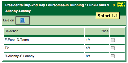
Then there is Camino. I’m really disappointed with it (version 0.7). Its support for CSS-P is much lower than what Firebird has, and I was forced to turn off some fancy stuff in order for page to appear correctly.
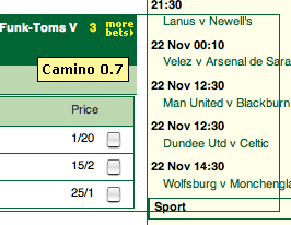
You might’ve noticed neat feature of the web site - for each displayed market it gives you a list of other markets for the same event. This is unordered list, initially hidden (with visibility, not display), absolutely positioned, and it appears when you hover more bets icon. Camino hides the list as everybody else, but also leaves empty space where list be - when you do mouse over, it proves that list is the cause of empty space. While on market templates that’s just a nuisance, on coupon templates is a real pain in the a*s.
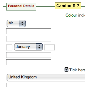
But wait, there’s more. On Open account page, Camino completely destroys the page, by not showing labels which are floated left (with proper width and display attributes).
This is way too much problems with single browser to deal with. I replaced more bets with drop-down version (on server-side I look for supporting browsers and display one or the other). Logs showed 10 (probably all mine) visits with Camino, so this browser is ignored for time being.
Fun continues with Firebird. (Sigh. It’s my favourite) The very same more bets feature, when used in coupons, is behaving strangely; it seems that Firebird is ignoring width property for the UL in this case. I had to use the kludge to get around this, by setting wanted width on A elements - it’s still ugly, but it works. This is almost certainly due to some error in style sheets, but I have yet to find where.
I have strange problem with IE5/Mac. For all UL lists used as menu, I have clearing div since all LIs are floated to left. Clearing div is styled as line-height:0;height:0;clear:both with additional style for IE font-size:0 (using * html hack). All browsers work as expected, except IE5/Mac which seems to totally ignore this style rule and render the non-breaking space, thus creating a gap.
Anybody has the idea why is this happening?
Final optimization
Ok, that was just one part of the story. Using structural HTML markup and CSS, we got 2x faster web sites, if only file size is concerned. There are more elements that define site speed, many of which are more important than sheer size of downloaded files.
Since web site is highly dynamic, with many sections and various functionalities, we have split the .css and .js files into dozens of smaller files. That makes it very easy to maintain, and it allows to call only files that are actually used on particular page.
Javascript files were calling one another using document.write("script..."), and CSS files were combined using one master file that called all other (row of @import url(...) rules.
In the end, where everything was developed, we had around 300kB of javascript files and few dozens kB of CSS files, with a total of nearly 30 files. Compressing the scripts (removing comments and unnecessary white space) saved around 40%. All of that was called from HEAD part of the document, which means that user had to wait 30 HTTP requests/response cycles to get to the content. And that was painful on crowded Internet connection.
New code had less than 200kB of scripts, which compressed were down to around 80kB. Using modern markup and CSS-P where possible, we managed to live without good part of the old scripts.
But it was not over yet. Modem speed testing showed that site is still slower (even with all files cached) than client competitors.
Enter Speed up your site by Andrew B. King, founder of webreference.com and known expert on HTML optimization. This book is absolutely fantastic. It has so many excellent advises, that after reading it I realized that I was never a true web professional. Until I read and learned the stuff from it. The Web Bible for any serious web developer.
We got biggest speed boost by applying the minimize the number of HTTP requests rule. We couldn’t do anything about the images used for text teasers or Flash banners, but we could do something with style sheet files and scripts. And it was so simple. All files were left intact, but instead of calling them all separately, I used simple
copy /b file1 + ... + fileN endfile
and then calling just the end file. In some cases, this lead to including the same file in several different end files, but overall benefit was so great that it was worth it. We were down to 10 files and page content was appearing much faster - not 3x but something like 5x faster due to variable latency for each HTTP response.
Along with CSS and JS compression (using tools like JS Cruncher Pro), we had very fast web site (considering the number of features).
Compressing…
Top of the cake was enabling HTTP compression, also recommended in Andy’s book. This is vast subject, and you can read more about in excellent article on IBM’s web site (and in many similar articles on the web; just use Google). Andy King is recommending not to compress CSS files, but we couldn’t find any problem in our test case, so we are compressing them too.
Site is hosted on the web farm consisting of Microsoft Windows 2000 servers, with IIS5. We first tried with IIS’s own HTTP compression utility, which appeared to be working correctly with all browsers except IE/win, because of some caching problem at client side. To make things even more funnier, any other ISAPI .dll worked perfectly with IIS and IE5. Go figure. In the end, we chose open-source Flat Compression - it works very good, for the price of very high CPU utilization (40-60% all the time). That is easily solved problem (just add more servers).
Believe me, cost of few additional servers is nothing compared with user satisfaction you gain. Compression will shrink the files 80% to 90%, which means that style sheet files of 25kB will be something like 3.5kB, script file of 49kB goes down to 8-10kB etc. Simply amazing feature - one must wonder why it was not used since the internet was born.
Keep in mind that IE5/Win has problems - if fires onload event when .js file is downloaded but before it was decompressed. By clever coding (Andrew has all these covered in the book), you can avoid that and enjoy the benefits.
Update (Mar 11):
It seems that 5.01 work properly, even when you have code that execute during page load.
Also, I thought it would be helpfull to show some actual figures of what compression really does. 43k instead of 210k?I’ll take it, anytime (figures are from highly commented development scripts).
Compressed from 39546 to 6800 (using gzip), url=/betnav/inc/script/BNHi.js

Compressed from 92691 to 19539 (using gzip), url=/inc/script/EngineHi.js

Compressed from 90550 to 16138 (using gzip), url=/betslip/inc/script/BSLayer.js
After all…
…life is good. We will continue to improve the site, watching gecko-line of browsers developing, as well as KHTML one, and offering support for handhelds and some older browsers (purely to prove the point) that currently can’t really use the site (according to logs, no one is actually using them to access site, but then…)

